
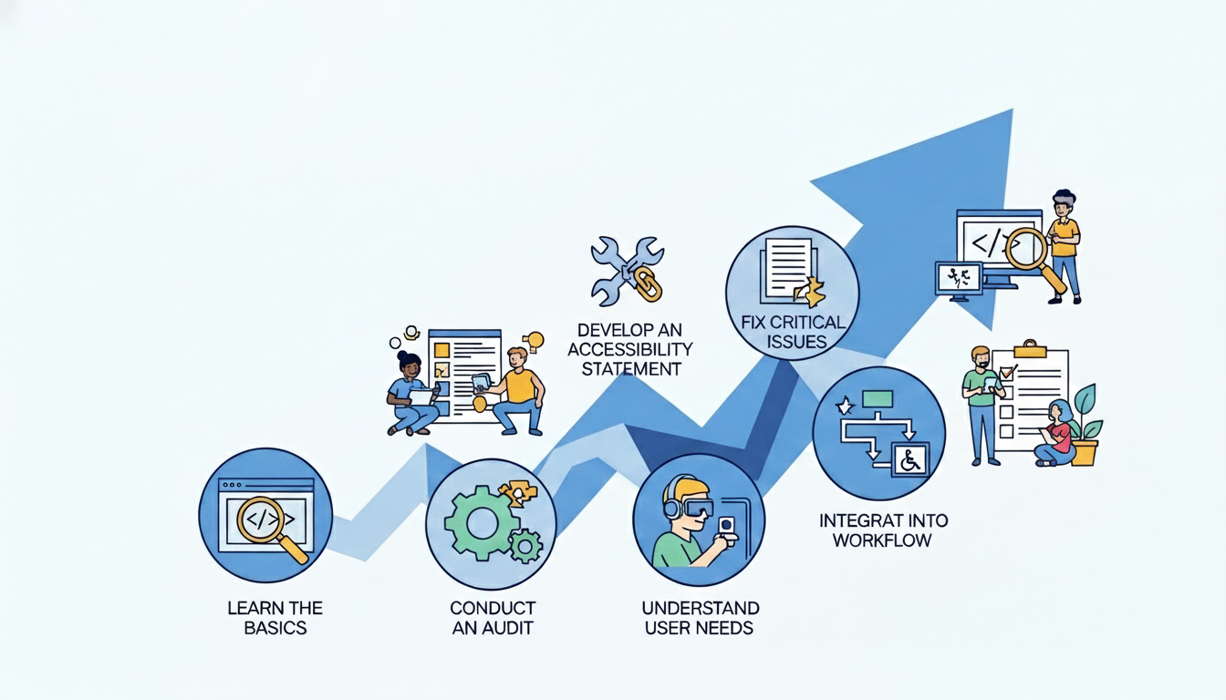
Web accessibility means everyone can use your website. This includes people with disabilities. It covers keyboard navigation, screen reader support, and color contrast.
An accessible website improves the experience for all users. It also grows your audience. Plus, it helps with SEO, usability, and trust.
Use this simple checklist to find issues and build a more inclusive website.
What Is Web Accessibility?
Web accessibility means building websites that everyone can use. This includes people with disabilities. It makes sure all users can see, understand, move through, and interact with your content. No matter their abilities, they should have equal access.
Types of disabilities to consider:
- Visual: Blindness, low vision, color blindness. These users may rely on screen readers or need high contrast and zoomable text.
- Hearing: Deafness or hard of hearing. They need captions for videos and transcripts for audio content.
- Motor: Difficulty using a mouse due to paralysis, tremors, or limited fine motor control. They may rely on keyboard-only navigation or voice control.
- Cognitive: Learning disabilities, distractibility, or memory issues. These users benefit from clear layouts, simple language, and consistent navigation.
Why Accessibility Is Important for Your Website
Web accessibility is not optional. It is essential for modern websites. Here is why you should prioritize it:
Better user experience for everyone: Accessibility features help all users. Clear navigation, readable fonts, and logical structure benefit everyone. These features do not just help people with disabilities. When your site is accessible, everyone finds it easier to use.
Legal compliance and risk reduction: Many countries have laws about web accessibility. The Americans with Disabilities Act (ADA) and similar rules require accessible websites. If your site is not accessible, you could face lawsuits and penalties. Following the standards protects you legally.
SEO benefits: Search engines like accessible websites. Proper heading structure helps them understand your content. Image alt text and descriptive links also help. These improvements can boost your search rankings.
Brand reputation and trust: When you care about all users, it builds a positive brand image. People notice inclusive businesses. They share their good experiences with others. This helps your reputation grow.
Wider audience reach: About 15% of the global population lives with some form of disability. Making your site accessible opens your business to millions of potential customers. Without accessibility, you might exclude them.
4. Web Accessibility Quick-Start Checklist
Ready to make your website more accessible? Here is a simple checklist to get started. Implement these items one by one. You will immediately improve the experience for all users.
✅ 1. Use Proper Heading Structure
Headings are the backbone of your webpage’s organization. They guide users through your content and help everyone—especially screen reader users—navigate easily.
One H1 per page: Your H1 is the main title of your page, like a book’s title. Use only one H1 per page to clearly communicate what the page is about. This helps both users and search engines understand your content’s main topic.
Logical H2–H3 hierarchy: Think of headings as an outline. Use H2 for main sections, H3 for subsections under H2, and so on. Never skip heading levels—going from H1 to H3 confuses screen readers. A proper hierarchy looks like:
- H1: Page Title
- H2: Main Section
- H3: Subsection
- H3: Another Subsection
- H2: Next Main Section
- H2: Main Section
Helps screen readers and SEO: Screen reader users can jump between headings. This helps them scan content quickly. It works like sighted users scanning visually. Search engines also use heading structure. They use it to understand your content’s hierarchy and relevance. Proper headings mean better accessibility. They also mean better SEO. That is a win-win!
✅ 2. Add Alt Text to Images
Alt text describes images for people who cannot see them. Screen readers read this text aloud. This makes visual content accessible to blind and low-vision users.
Describe the purpose of images: Write concise, meaningful descriptions. These should convey the image’s purpose. For a product, include brand and key details. For example, “blue cotton t-shirt with round neck.” For charts, summarize the key data shown. Ask yourself: what would you tell someone over the phone?
Avoid keyword stuffing: Alt text is for accessibility, not SEO. Don’t cram keywords like “buy cheap shoes online.” This frustrates screen reader users and can hurt your SEO. Keep descriptions natural and helpful—usually under 125 characters.
Decorative images should be marked properly: Some images are purely decorative. Examples include decorative borders or stock photos with no meaning. For these, use empty alt text like alt=””. This tells screen readers to skip them. Otherwise, users waste time hearing “image” with no useful information.
✅ 3. Ensure Good Color Contrast
Good color contrast makes your text readable for everyone. This is especially important for users with low vision or color blindness. When contrast is too low, content becomes invisible.
Text readable against background: Text must stand out clearly from its background. Dark text on light backgrounds or light text on dark backgrounds work best. WCAG guidelines require a contrast ratio of at least 4.5:1 for normal text and 3:1 for large text.
Avoid light gray text on white: This is a common design mistake. It makes content nearly impossible to read. Light grays, yellows, and pastels on white create insufficient contrast. If you struggle to read it, so will your users.
Use contrast checking tools: Free tools can check your contrast instantly:
- WebAIM Contrast Checker
- Chrome DevTools
- Color Contrast Analyzer extensions
Simply enter your colors—the tool tells you if they meet WCAG standards. Aim for AA rating at minimum. Good contrast means better readability for everyone.
✅ 4. Make Your Website Keyboard-Friendly
Many users cannot use a mouse—they rely on keyboards to navigate websites. Making your site keyboard-friendly ensures everyone can access your content.
Users should navigate without a mouse: Test your site by unplugging your mouse. Can you reach all links, buttons, and forms using only the Tab key? Every interactive element must be keyboard-accessible. If you can’t reach something, neither can keyboard users.
Clear focus indicators: When users tab through your site, they need to see where they are. Browsers show a default outline (usually a blue ring) around the focused element. Never remove this outline completely—it’s essential for keyboard users. Make sure the focus indicator is clearly visible.
Logical tab order: The tab order should follow the visual layout—top to bottom, left to right. Users should move through content naturally without jumping unexpectedly. Test this by tabbing through your entire site. If the focus jumps randomly, fix the HTML structure.
Quick tip: Interactive elements like links, buttons, and form fields should be focusable. Non-interactive elements should not trap keyboard users.
✅ 5. Use Clear, Simple Language
Clear language makes your content accessible to everyone. This includes people with cognitive disabilities. It also helps non-native speakers and busy readers. Simple writing benefits all users.
Short sentences: Break long, complex sentences into shorter ones. Aim for 15-20 words per sentence maximum. One idea per sentence works best. Short sentences are easier to read and understand.
Plain English: Use everyday words instead of fancy alternatives. Say “use” not “utilize,” “help” not “facilitate,” “show” not “demonstrate.” Write like you’re explaining something to a friend. This makes content accessible to more people.
Avoid jargon: Industry terms and technical acronyms exclude readers who aren’t experts. If you must use specialized terms, explain them simply. Ask yourself: “Would my grandmother understand this?” If not, simplify it.
Quick tip: Read your content aloud. If it sounds unnatural, rewrite it. Clear language isn’t just accessible—it’s more persuasive too.
✅ 6. Label All Forms Properly
Forms are essential for user interaction. Poorly labeled forms create barriers for everyone, especially screen reader users.
Every input must have a label: Each form field needs a clear, visible label. The label should describe what information to enter. Use the HTML <label> element. Placeholder text alone is not enough. It disappears when users start typing.
Clear error messages: When users make mistakes, tell them clearly what went wrong and how to fix it. Don’t just say “Error.” Specify “Please enter a valid email address.” Highlight the problematic field.
Required fields clearly marked: Indicate which fields are required before submission. Use an asterisk (*) with explanatory text like “Required fields are marked with *” at the top. Don’t rely on color alone—not everyone sees color differences.
Quick tip: Test forms with keyboard only. Can you reach all fields? Does tab order make sense?
✅ 7. Add Captions to Videos
Video content is popular, but without captions, you exclude deaf and hard-of-hearing users. Captions also help people in noisy environments or those learning your language.
Closed captions for spoken content: Provide synchronized captions for all spoken dialogue. Include important sounds as well. Closed captions let users turn them on or off. YouTube and Vimeo offer automatic caption generation. But always review and edit for accuracy.
Transcripts when possible: A full written transcript provides even more accessibility. Transcripts help deaf users. They also benefit people who prefer reading. They help those who need to search content. They help people who want to quote your video. Place transcripts near the video. Or link to them clearly.
Quick tip: Don’t forget to caption live videos too. Services like StreamText offer real-time captioning. Good captions mean your message reaches everyone, regardless of hearing ability.
✅ 8. Make Links Descriptive
Links are how users navigate your content. Descriptive links help everyone understand where a link will take them. This is especially important for screen reader users.
Avoid “Click here”: This tells users nothing about the destination. Screen reader users often tab through links to scan content quickly. Hearing “click here, click here” is frustrating and unhelpful.
Use meaningful link text: Write links that make sense out of context. Instead of “Click here to read our guide,” use “Read our complete accessibility guide.” Instead of “Learn more,” use “Learn more about web accessibility.”
Quick tip: Imagine reading only the links on your page. Would you know where each one goes? If not, rewrite them. Good link text improves navigation for everyone and helps search engines too.
Common Accessibility Mistakes to Avoid
Even well-intentioned websites make these common accessibility errors. Avoid them to ensure your site works for everyone.
Missing alt text: Images without alt text leave screen reader users confused. Every meaningful image needs descriptive alt text. Decorative images should have empty alt attributes (alt=””).
Poor contrast: Light gray text on white is unreadable for many users. Yellow on light backgrounds is also hard to read. Always check contrast ratios. Aim for at least 4.5:1 for normal text.
Auto-playing media: Videos or music that start automatically can be disorienting. This is especially true for screen reader users. Always let users control when the media plays. Provide pause buttons.
Using color alone to convey meaning: Don’t rely only on color to show errors, required fields, or status. Add icons, labels, or patterns so color-blind users understand too.
Tools to Test Your Website Accessibility
Testing your website for accessibility is easier with the right tools. Here are simple options to get started:
Browser accessibility checker extensions: Install extensions like Axe or Siteimprove in your browser. They scan pages instantly and highlight issues with clear explanations and fix suggestions.
Lighthouse (Chrome DevTools): Lighthouse is built into Chrome. It generates accessibility reports with scores. It also gives specific improvement recommendations. Find it under “More Tools” in Developer Tools.
WAVE tool: This popular free tool comes from WebAIM. It shows accessibility errors visually on your page with icons. Just enter your URL. See problem areas highlighted right away.
Manual keyboard testing: Unplug your mouse. Navigate using only Tab, Enter, and arrow keys. Can you reach everything? Is focus visible? This simple test reveals many issues instantly.
How to Make Accessibility Part of Your Workflow
Accessibility isn’t a one-time fix—it needs to be part of your regular process. Here’s how to make it stick:
Include accessibility in the design phase: Do not wait for development to think about accessibility. Start with contrast, readable fonts, and clear layouts. Add accessibility to wireframes and mockups from the very beginning.
Accessibility checklist before launch: Check accessibility before any site goes live. Use a simple checklist. Test keyboard navigation. Confirm alt text. Verify color contrast. Run automated tools. Make this a standard part of every launch.
Regular audits: Schedule quarterly or bi-annual accessibility audits. Websites change constantly—new content, updates, features. Regular checks catch issues before they pile up.
Team training: Teach your designers, developers, and content creators the basics. When everyone knows why accessibility matters, they will include it naturally in their work.
Conclusion
Web accessibility helps you build a more inclusive website. Small changes can have a big impact. Add alt text to images. Use proper color contrast. Make sure keyboard navigation works well. These simple steps help users with disabilities.
Begin with the basics. Test your site often. Listen to user feedback and make improvements. Accessibility is not a one-time project. It is an ongoing journey. It benefits your users and your business too.

Leave a Comment